Thanks to the MSDN license provided to me by Sapient GS (“Gee Ess!”), I downloaded a copy of Visual Studio 2010 Ultimate and decided to poke around a little bit to take a quick look at what’s new. Just a little history on me and VS - I started with .NET 1.1 and Visual Studio 2003 back in you know, like 2003 or so, moved on to .NET 2.0 and 2005, .NET 3.5 with 2008, a few beta releases in between here and there, and now, finally what everyone's been waiting for.. Visual Studio 2010. Wow, what a long and crazy journey it has been.
Anyway, I’ve opened it now for a good five minutes and right away I noticed some very interesting changes that I thought I’d share! To begin with, after installing, as expected, Visual Studio asks you about your environment preferences (web, general, C#, etc.) so I picked general, because according to the description “Select general if you expect to be writing in several different languages.” Yes, I am bilateral, so I choose the General Settings.
<-- The very cool “2010” icon!
Aside from the new look and feel of the UI, everything looks very familiar so far. I quickly selected a C# Web Application, and then whoah, this is where things got interesting.
Take a look at this bad boy (pictured below)! This is the solution explorer, as expected, but look closer:
Right away, 2010 now pre-loads a bunch of files and folders for you, template style. One of the things that I noticed right away was that the app is automatically pre-configured for use with a MasterPage (Site.master), automatically includes jquery (way cool) script files, a folder with Account pages, a Default and About page, and even a Site.css, that’s actually styled pretty nicely. Using Masterpages, jquery, and having your authentication pages separated into a separate folder are all best-practices that we’ve all learned to use over the years, but I thought it was intelligent of Microsoft to kind of steer you towards that direction right off the bat. Not only that, but it saves you some time.
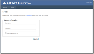
The nicely “web 2.0 styled” log in page, offered by .NET.
Taking a closer look at the css file I found a very nicely commented and formatted style sheet, which is very easy to read through and modify to your heart’s content. This is great for developers who are new to css or who have a bad habit of using in-line styling. I think once again, Microsoft is trying to point our lesser experienced developer friends away from the bad habit of in-line style, and teaching people how to use style sheets. Bravo MS, bravo.
Taking a look at the login.aspx page itself, I found that the page is nicely coded using fieldsets and legends (a great thing to do for accessibility and 508 compliance), requiredFieldValidators for the textboxes there, with a ValidationSummary at the top of the page to display your errors (also very good for accessibility). Of course, the login control itself is Microsoft’s own Login control released with .NET 2.0, but styled here quite nicely using the Layout tag, which I’m glad to see, because I always hated the default look of the ASP.NET Login control. This one is much more usable in my opinion, and demonstrates how easy it is to customize that piece.
The rest of the pages follow suit, subtly hinting at the best ways to do things, and reducing the level of effort to get a site up and humming. I’m very impressed by Microsoft’s recognition of development and design trends, and how they’re using a template to continue to point in everyone in the same direction.
Anyhow, just a quick review post today. Hopefully I’ll get to do something real on this IDE over the next months while I’m swimming in Java land. Peace!


No comments:
Post a Comment